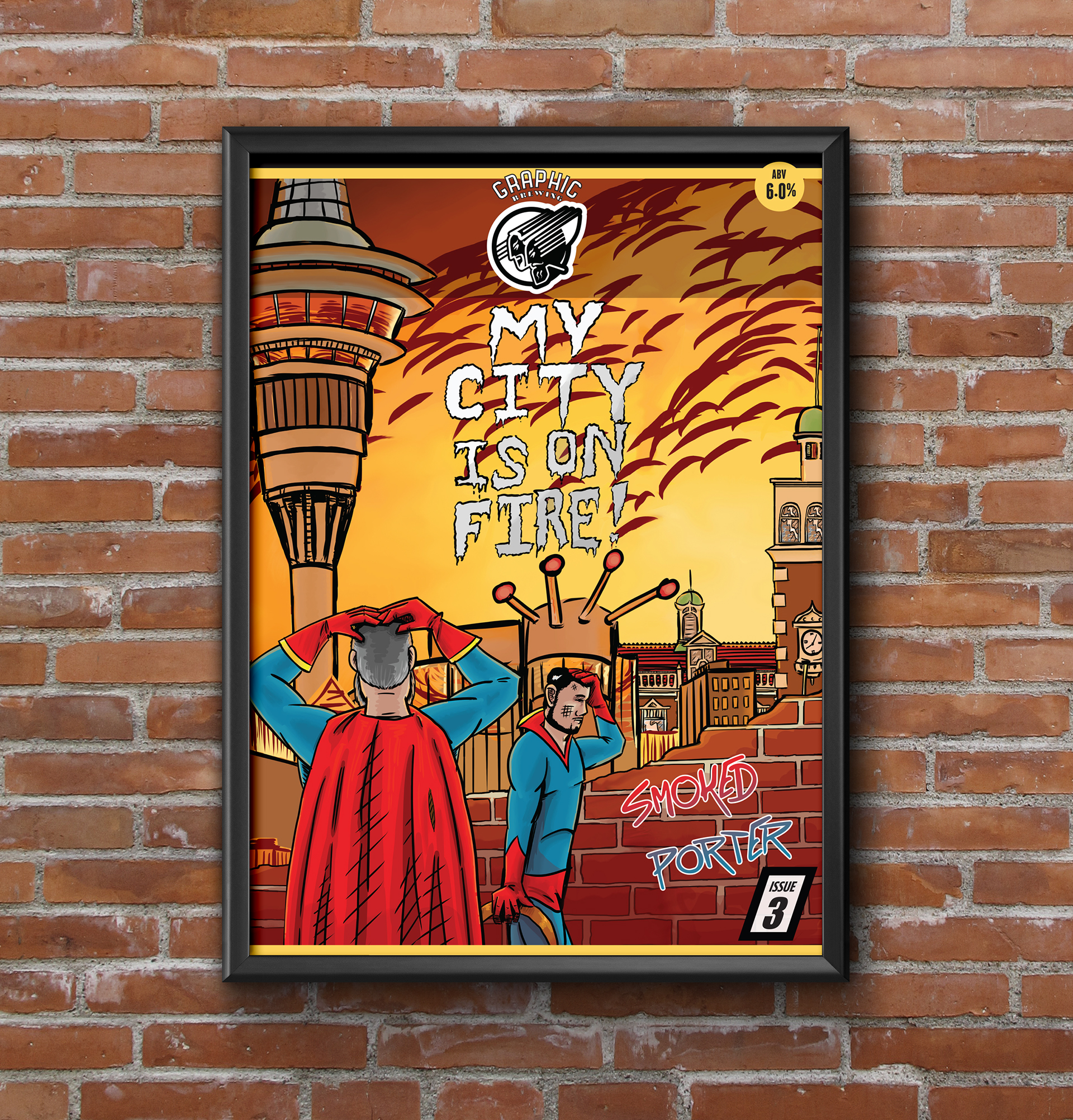
Layout Design for Graphic Brewing Poster ‘My City is on Fire’
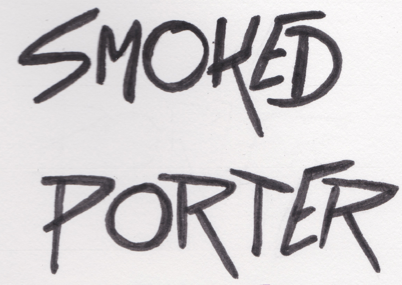
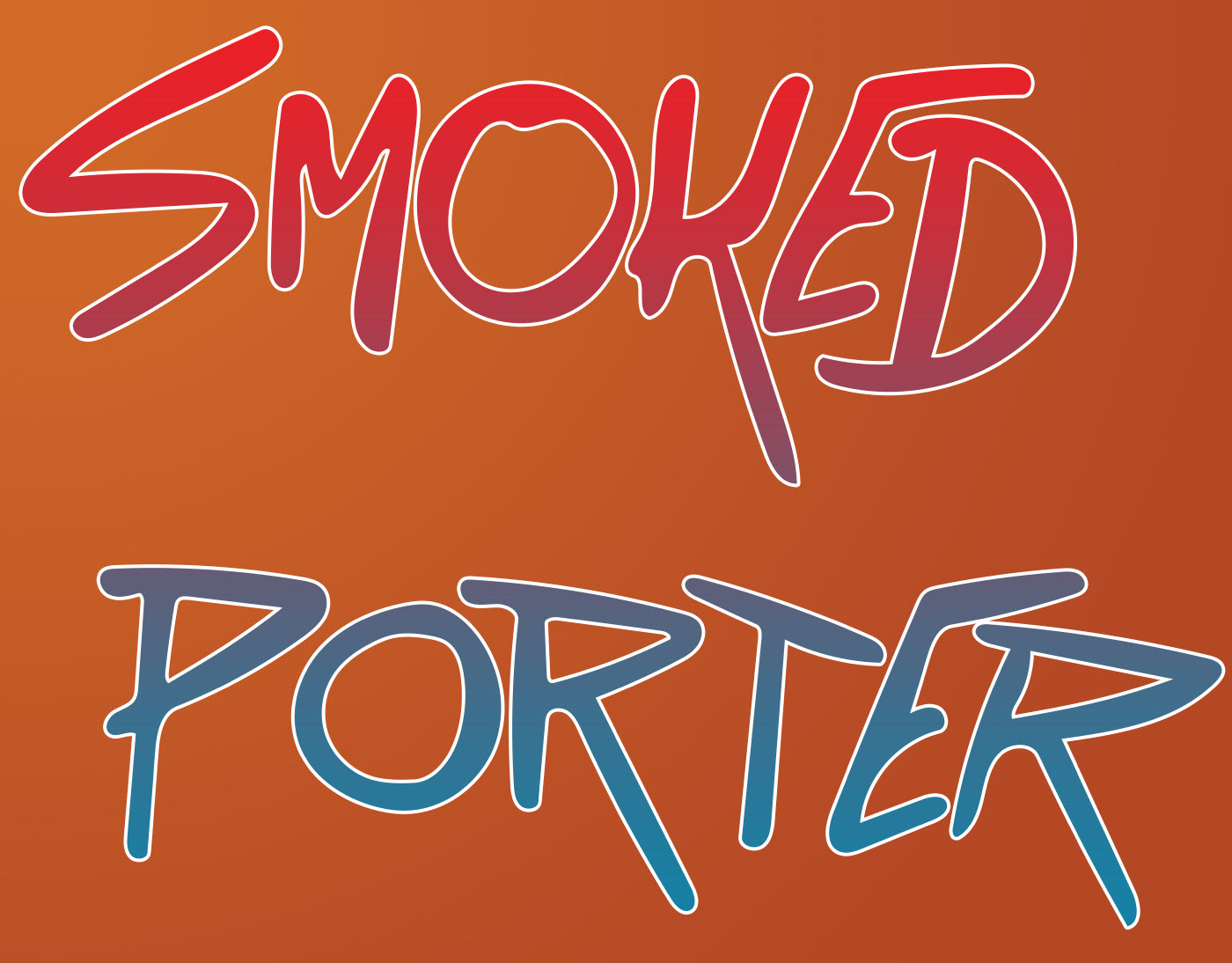
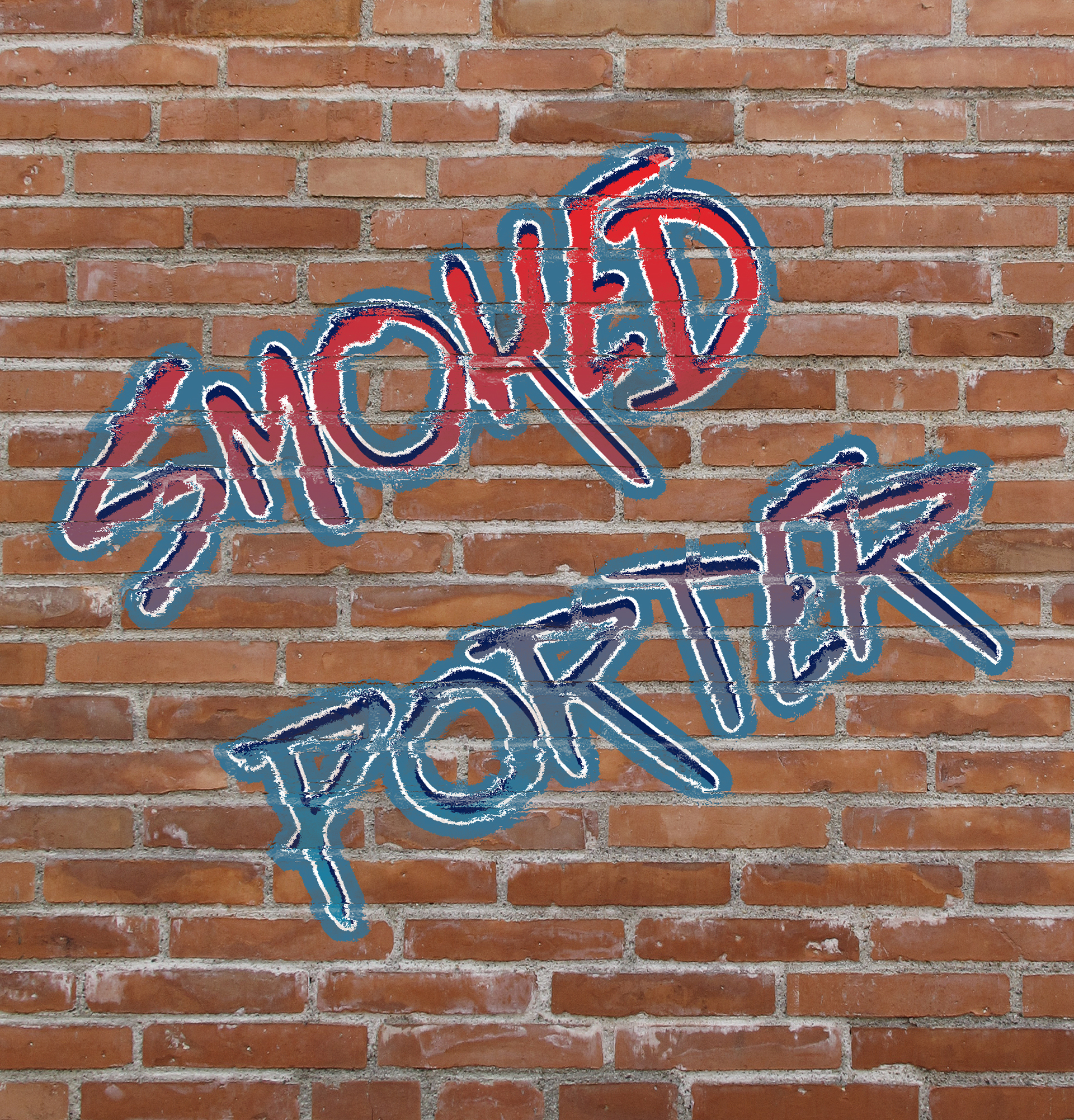
Art assets were provided by the client, although they requested that a ‘Smoked Porter’ graffiti-style secondary logo be created.
The artwork provided didn’t quite fit the layout of the poster and some of the buildings and the characters had to be cut out and pasted back in on separate layers.
This also meant that some of the background had to be re-painted in Photoshop in the style of the original artist.


