I am currently taking part in the MIID Winter School, creating surface pattern designs for both the intermediate and advanced tracks. I have just submitted the last briefs for both tracks.
Intermediate Creative Brief 2: Kabuki’s Kingdom
For my take on the brief, I looked to traditional Japanese Kabuki theatre set designs and was inspired by painted backdrops. There is also a nod to the traditional striped theatre curtain in my pattern design, overlaid on the Sakura blossoms. The stage curtain in Kabuki theatres does not part in the middle and is pulled from one side of the stage to the other by a stagehand. The curtain is striped either in red, green and black, or red, green and white. The stripes in my pattern are pastel versions of these colours from the palette provided by MIID to go with the brief.
To create the sakura blossoms, I first painted a few in my sketchbook, and then scanned them. I opened the scan in Photoshop and made a custom sakura blossom brush.
Work in Progress:

Finished Design Mockup:
Advanced Creative Brief 2: Fauna Cyanotype
What is a Cyanotype?
A Cyanotype is created when objects placed on a photo-sensitive piece of paper are exposed to sunlight.The two chemicals used to create cyanotype solution are ferric ammonium citrate and potassium ferricyanide. After mixing equal parts of these two chemicals and then applying the solution to watercolour paper, items such as plants and and printed transparencies can be placed on the photo-senstive paper in sunlight.
The sunlight causes a chemical reaction to occur. The chemical solution which has soaked into the paper reacts with the ultra-violet rays, turning any exposed areas blue.
When the items placed on the paper are removed, a ghostly white image of the items is left behind as these parts of the paper were not exposed to the light.
I did find kits for cyanotype making and pre-pared paper kits but I needed to start my project right away!
Problem: how to create a Cyanotype without the chemicals?
First I tried imitating the look of cyanotypes by painting with watercolours, but I wasn’t entirely happy with the results. I couldn’t get the slightly ghostly look I wanted.

Solution: Anthotypes
To make an anthotype you just need an emulsion of light-sesitive material which you can make by crushing up leaves or plants with distilled water or denatured alcohol.
These emulsions can then be painted onto watercolour paper and the same process is followed as for a cyanotype. You place the items you would like to ‘print’ onto the paper, preferably as flat as possible and then you expose the paper to sunlight.
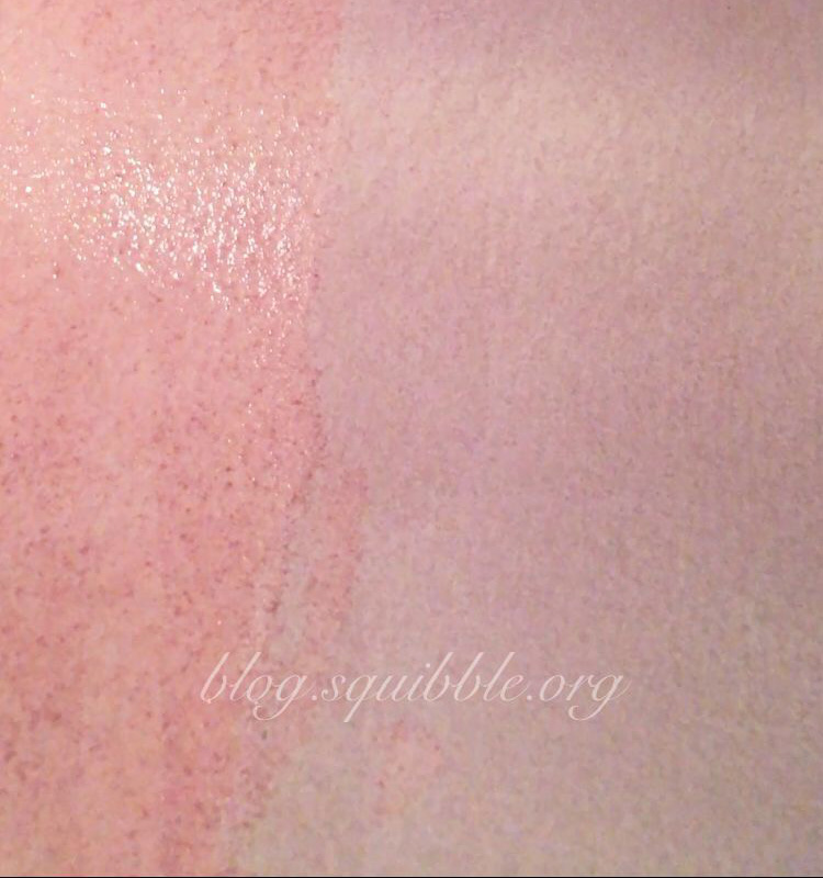
I painted emulsions of turmeric and water as well as red wine on to watercolour paper.


Both seemed to work well, although all pieces had not been bleached out enough by the time my assignment was due.
It helps to sandwich whatever items you are printing onto the paper with a piece of clear glass or acrylic. This is because the exposure time is much much longer than that of a cyanotype. It is also a good way of stopping the items from accidentally moving around on the paper.
I did not have a piece of glass or acrylic handy, so I simply pressed down the plants and flowers I wanted to expose as much as possible. Then I pulled a clear piece of sandwich bag plastic as tight as possible around the paper and backing board. For my A2-sized red wine print I pulled a large piece of cellophone of the paper and taped it firmly in place.


Emulsions:
- Turmeric and water
- Red wine
Out of curiousity, I also dug out my cheapest watercolour set, assuming that it would not be too lightfast.
All of the emulsions took a long time to bleach out. Even though I had read that in strong sunlight it can take as little as one to three hours, after two days in strong New Zealand summer sunshine my turmeric anthotype had only bleached out just enough so that I could see a few golden outlines of the leaves. The colour stayed a bright golden yellow where the plants had been resting on the paper, while the turmeric emulsion exposed to the sunlight turned a yellowish brown.

I decided to leave all my other anthotypes in the sunshine for as long as possible so I can get the best possible results.
This means I did not get to use an actual set of anthotypes for my final pattern design, but I did utilise the texture and also the dried plants.
For my final pattern design I used the now dried plants from the first turmeric anthotype. I scanned the plants and also a piece of watercolour paper painted with turmeric along with another piece painted with blue watercolour paint.
I layered everything in photoshop and played with mirroring the different elements to create a pattern. One of my favourite elements of this design is the tiny floral ghostly bee:

I really ejoyed experimenting with different techniques and ways of creating patterns for the second lot of creative briefs. My anthotype experiment will now become an ongoing project, and I can’t wait to try a real anthotype with the proper chemicals!
These designs are now available on bother my Redbubble and Society6 stores!